WORDS BY FLOBO BOYCE
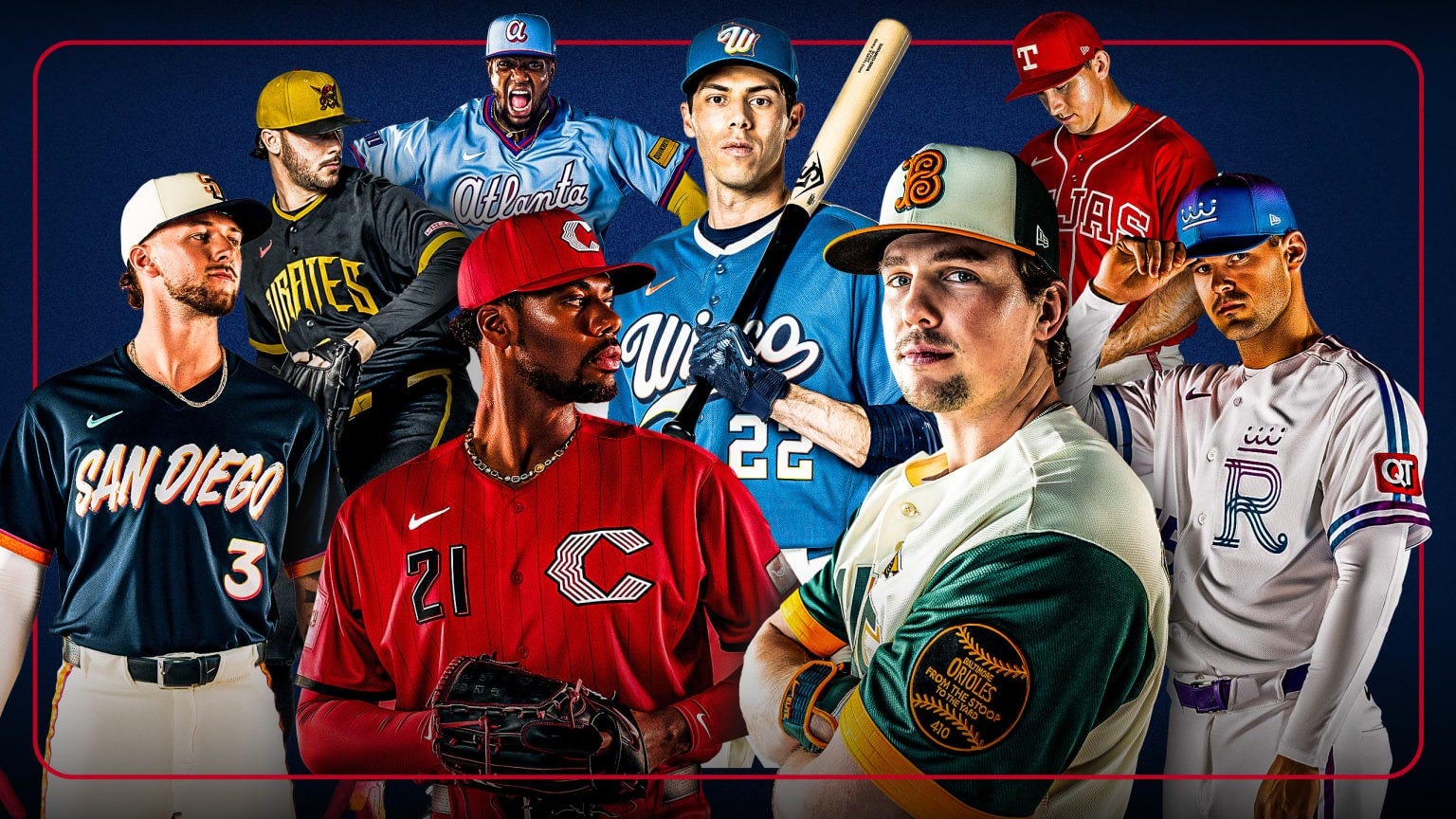
By the time you read this, it will be too late. The eight latest City Connect uniforms have dropped, and well, as always, the results are mixed. The Nike City Connect uniforms have been a symbol of the modern MLB: Giving new ways for fans to engage with their team while ticking off purists in the process.
The Texas Rangers, Baltimore Orioles, Milwaukee Brewers, San Diego Padres, Kansas City Royals, Pittsburgh Pirates, Cincinnati Reds, and Atlanta Braves all released their second-ever City Connects a little over a week ago and they have already been a success for the franchises. Club shops have been struggling to keep up with demand, but even the success of the launch does little to quiet the small waves of backlash that are out there. In a word, the drop was polarizing. Whether or not you thought the new jerseys were a downgrade from the team’s original effort, think the whole thing is a cash grab, or hate the City Connect program outright, everyone has had something to say about these.
Here on the Black Baseball Mixtape, we covered a selection of City Connects from the past year. (Like THIS, or THIS, or THIS). And this leads me to my first (and perhaps biggest) gripe of this year’s crop: The Rollout. There was a single article that was thrown up on MLB.com that said, “These eight jerseys are up next. Buy now.” This “Here, damn!” energy kind of kills a bit of the excitement over the drop. After years of staggered rollouts complete with teaser videos, release hype videos featuring hip-hop artists, and more often than a spoken work script telling us why we should care, we saw that get replaced for a press release… ?
As an aside, I am also growing skeptical of the “leaked photos” that surfaced online weeks before the jersey announcements. Not that I don’t like a good sneak peek if it’s the real thing, but I’m starting to ask who exactly is leaking these jerseys in the first place? Are they truly even leaks? OK, I’ll put my tin foil hat away.


Just a crisp, hi-res leak that nobody motioned to take down, nothing to see here.
I was never one to rank City Connects. Frankly, you’re going to like what you like and hate what you hate. If you’re keen to see one though, The Athletic attempts to do so by committee, ultimately declaring the San Diego Padres jersey ‘the winner.’ Instead, I like to look at each piece on their own and treat each City Connect jersey at what they are: Street-level fashion pieces parading as a jersey. In other words, the teams wear the shirt, but these are designed for fans to purchase and accessorize the way they see fit.
The paradox is not lost on me, though. How some rush to rank them but while at the same time claiming each group is the worst collection of jerseys, ever. I reckon that’s by design. Much like how a “spicy” chicken sandwich at a major fast food joint isn’t really spicy, these uniforms are offering just enough flair to be considered different, but they stop at the ledge of doing something daring. Not sure if that’s because of harsh guidelines given by the MLB or that more bold concepts were whittled down during the review process, but if I were to give a name to the 2026 City Connect class, it would be, “Intentionally Mid.” Let’s get into it.
Tejas Rangers
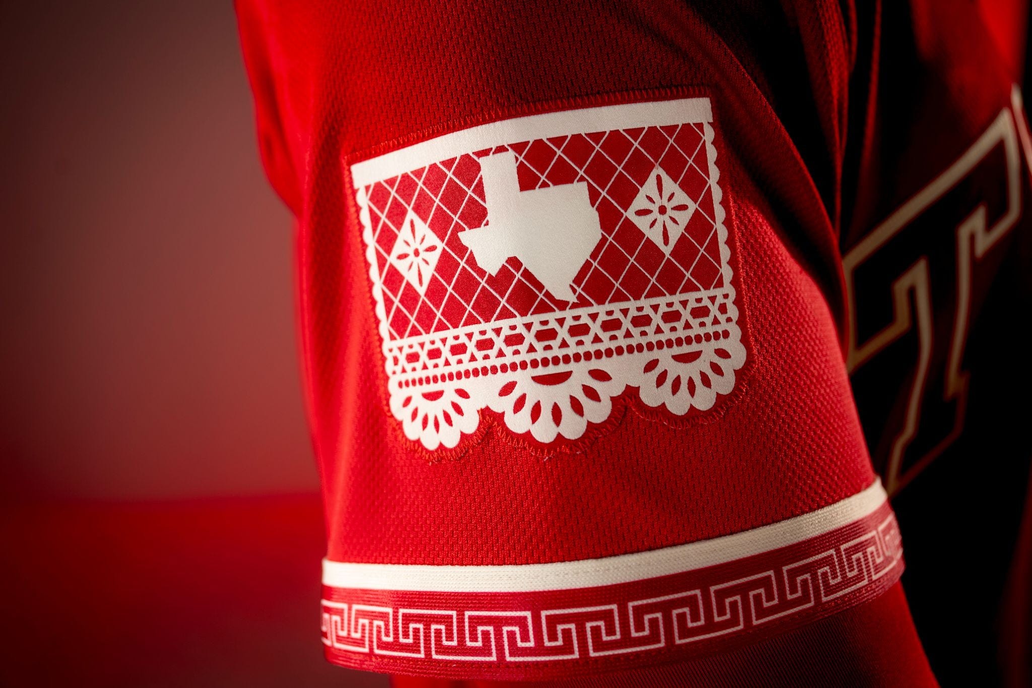
Perhaps the most baffling entry was this red “Tejas” jersey from the Texas Rangers. I know I was in the minority in liking the original, white and black ‘Straight Up TX’ numbers. This one is vivid enough, a stark shade of red with elements that lean into the Tex-Mex culture throughout the state. There is a bold charro pattern on the shirt and trim, and a papel picado-style graphic for the sleeve patch. Despite this, the whole look from a distance feels like more of a collegiate team than one of squads in The Show.
The Wisco Brewers
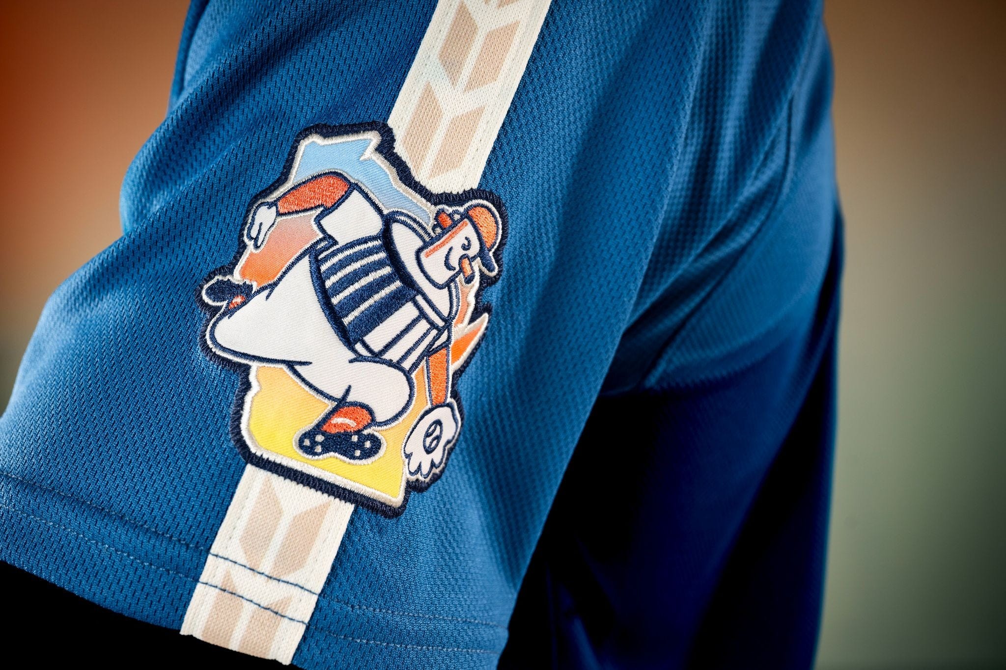
I’ve been to Wisconsin exactly once, and to be honest, I kind of like it. It’s a town that knows what it is, and this new jersey for the Milwaukee Brewers knows what it is as well. It’s a “friendlier” feel compared to the Brew Crew’s more traditional uniforms. It feels like it’s made to show you what being under the Wisconsin sky during the summer should feel like. I love how they incorporated Barrelman onto the sleeve, though I’m not sure anyone has ever said the word “Wisco” ever.
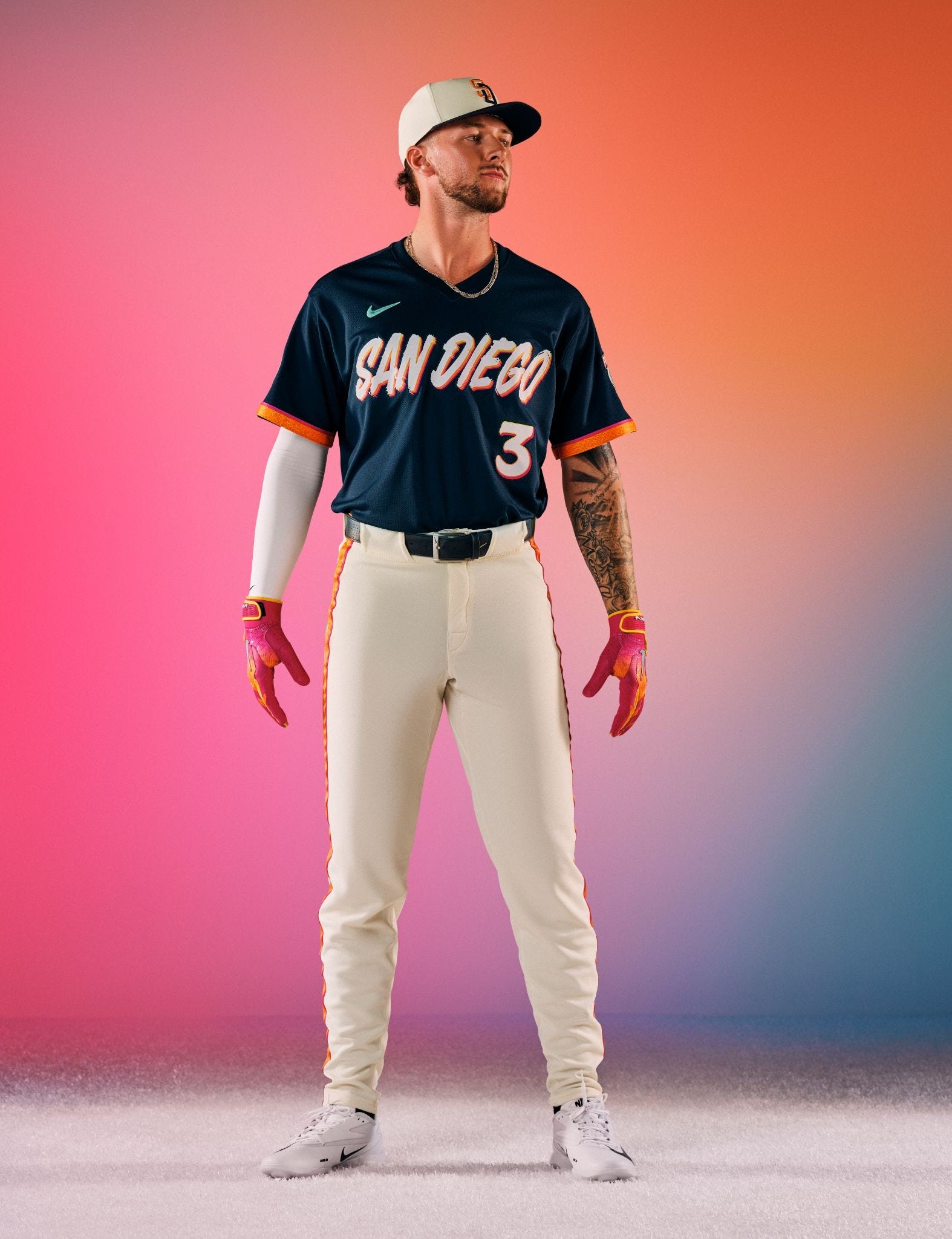
La Catrina and Los Padres
You want colors? Check. You want nods to Mexican culture? Check-check. The San Diego Padres are back with a number that goes for the colors their brown and yellow numbers forgot. This time, however, they are skipping the ice cream and sprinkles look for one that pays homage to Mexico’s Day of the Dead traditions. Some would say that concept is a little worn, especially if you follow Minor League Baseball’s La Copa Diversion alternate identities. To that, I say, I can see fans picking up this one if they have something with a bit more flair in their closet.
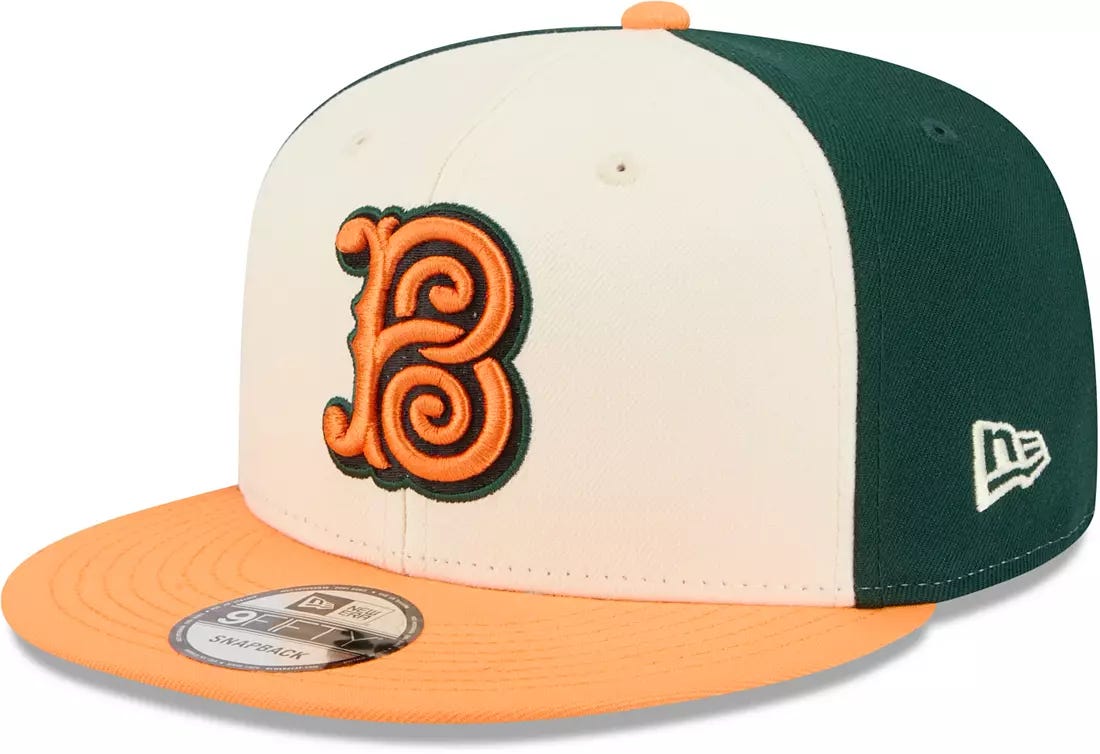
We Goin’ Huntin’ in Bmore
Baltimore’s first City Connect was clean, if not a little too simple. This one? Fans of off-white, green, and orange are going to be delighted. Baltimore…or should I say “BMORE” comes across with a color palette that would be perfect for a fall day. Perhaps that’s the point, fall and baseball. Truth be told, it’s supposedly paying homage to ‘Baltimore’s beloved stoops.” The colors look a bit too much like hunting gear, and that cap insignia a bit too much like a Northeastern boarding school for wayward children, but I’m sure I’m in the minority. It may be the most unapologetic entry of the bunch, and that alone may be worth it for Charm City.
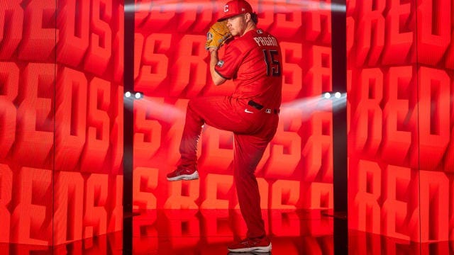
Yo, I Heard You Like Red
The original Cincinnati Reds City Connects were a bold step for the oldest active MLB franchise. It was dark, yes, but the bold “CINCY” lettering and the red trim were intimidating. This new one? It’s red. Like really red. And that’s it. I like that the alternate C insignia makes its way to the chest, alongside front of jersey numbers, but yeah. It’s red for red’s sake because it’s The Reds. I’ll have to wait a couple more years for an ice-cream themed jersey in collaboration with Graeters. At least there’s pinstripes…?
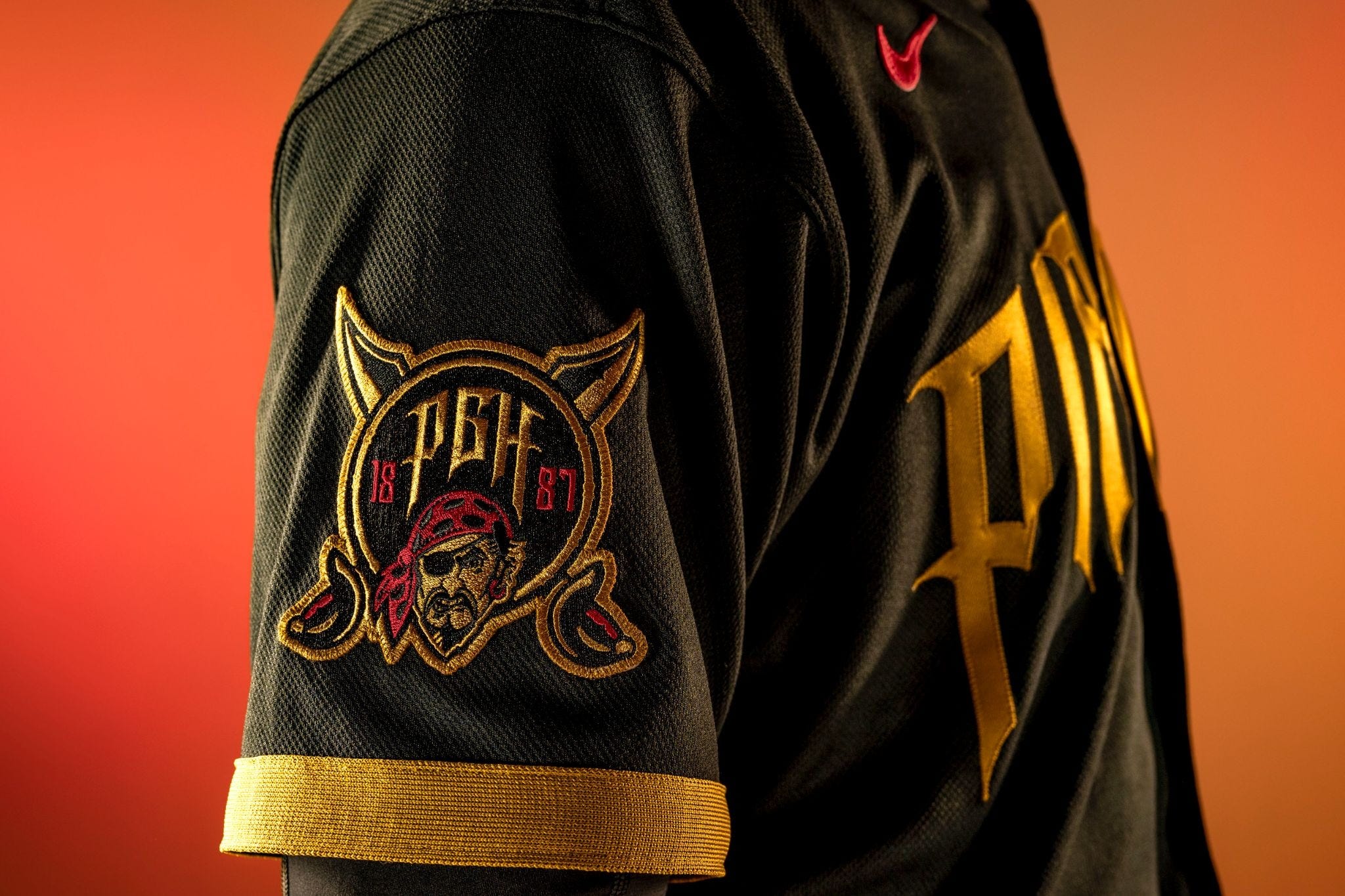
Pittsburgh Pirates…I Guess
Pittsburgh drew the unlucky straw by having a City Connect uniform that would’ve been at home as a regular uniform. The black and yellow colorway is the same. The PIRATES on the chest has a different flavor with its “tattered flag” or “sharp blade” typeface, but honestly, that’s pretty much what you can see from a distance. MLB.com noted that it gives off “Batman vibes,” but I’m pretty sure if you were going to do that, you could’ve been a black and gold outline of the old Pirates logo on the chest and be bold with it. I’d settle for a Jolly Roger.
Atlanta is Blue
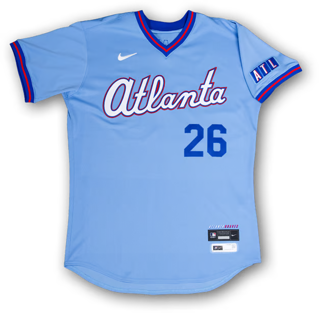
A new City Connect because I guess they had to, the Atlanta Braves dropped their latest edition with powder blue on their minds. And look, the design itself isn’t bad, but it seems like a miss on two levels. For one, the original Blues were one of the most sought-after City Connect jerseys. The other? I don’t know, but the Braves still occupy the same division as the Philadelphia Phillies. You know, THEE powder blue merchants. It’s Philly’s look, and Atlanta went ahead, and baby brother’d themselves for no reason. I bet it still sells like hotcakes, as the trim colors open this jersey up to being a casual wardrobe staple.
We’re Royals…
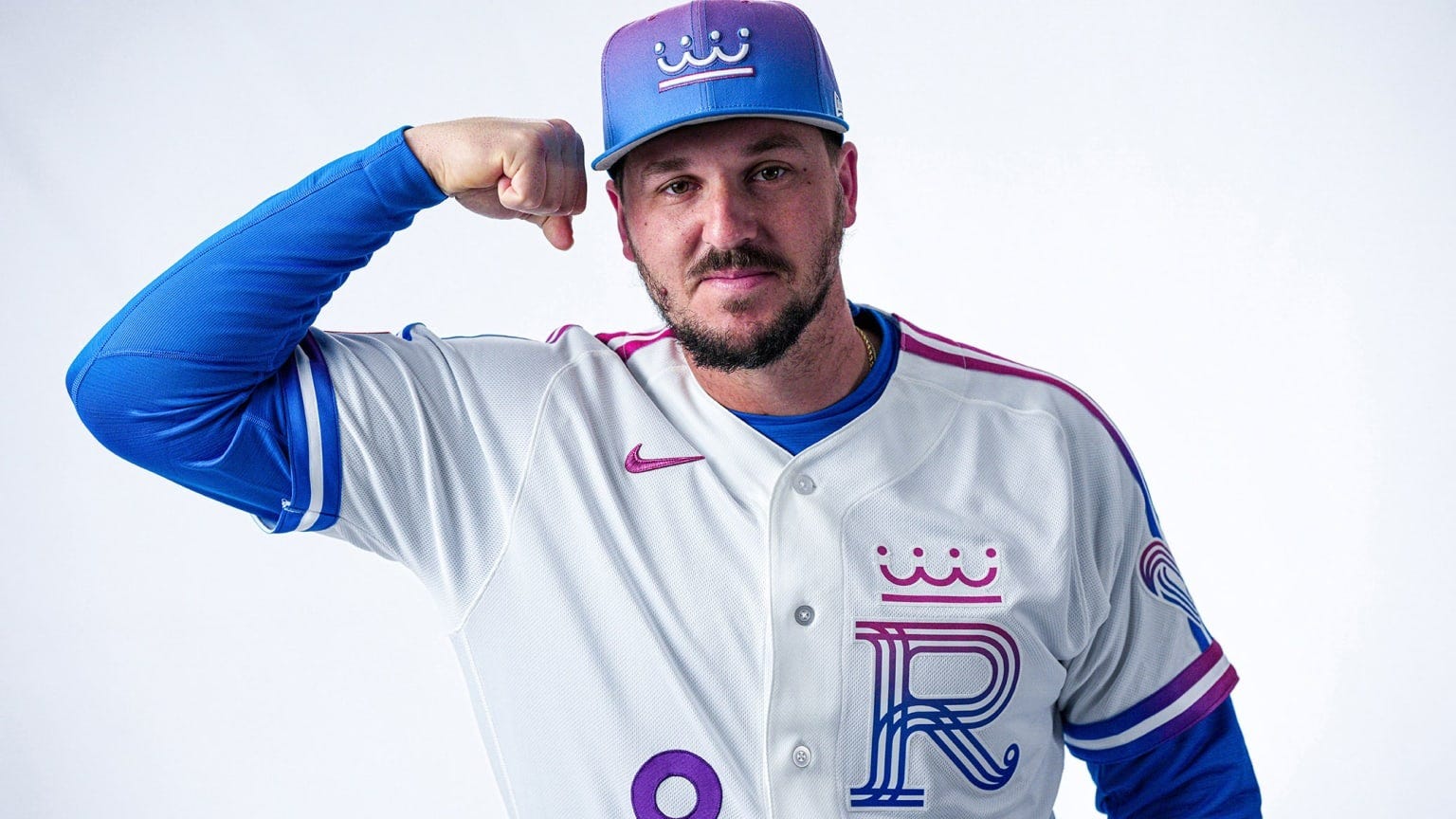
While this Royals update is my personal favorite of the bunch (in terms of what I would actually buy, not necessarily the best), it is wild that the Kansas City Royals went with such a departure here. No, it’s not as bold as glow in the dark colors, but their jerseys and hats come with this pink to blue gradient that would be more at home with being a Miami Marlins concept. Sometimes, when it comes to baseball media, the Royals get overlooked. I can tell you though wearing neon purple and pink is one way to make sure you’re not ignored. You might get confused for being a painter, but you will not be overlooked!
At the end of the day, without some of the more in-depth articles about the origination of the design of these jerseys, without some of the hype videos starring rappers from back in the day and celebrities you barely recognize, a lot of what made the early City Connect jerseys work get lost in the ether. Fans who want to pick something up from this crop basically have to bring their own lore to the register. And I suppose that gives the 2026 class that cash grab feel. There’s just enough stylistic choices to be different, but enough to really inspire a movement beyond the fabric. It’s the Casual Fridays of MLB unis, some of the more bolder expressions excluded. And no, I don’t mean a webpage where you explain the elements of the jersey–that’s a good side dish but not the main course–you’ve got to sell me the feeling of what wearing the jersey means. This is why this writer ranks say the Guardians or the Mets City Connects a bit higher than most. Those two franchises tried hard to evoke a different vibe with their media push. Here’s a thought, though: Perhaps let local designers draft the next round of threads.
Now that would be a whole new way to connect to the city.